
A delivery estimate that reads cleanly on a wide desktop monitor can turn into a cramped, wrapping mess on a phone screen — and most of your traffic is probably on a phone screen. If your estimate is technically showing up but looks awkward or gets cut off, it’s doing less work than you think.
Here’s what actually changes for delivery estimates on mobile, and what to check to make sure yours holds up.
Why Mobile Changes the Calculus
Mobile shoppers scroll faster and read less carefully than desktop shoppers — attention is a scarcer resource on a small screen with a thumb doing the navigating. A delivery estimate that’s slightly too long, or wraps into three lines, is easier to skim past without registering.
Vertical space is also tighter. On desktop, an estimate sitting below the price with room to breathe looks intentional. On mobile, if your theme stacks several elements close together, that same estimate can get visually lost between the price and the add-to-cart button.
| 🎯 NOTE Most WooCommerce themes handle responsive layout automatically, and a delivery estimate rendered as standard text inherits that behavior. The issue is rarely broken layout — it’s usually text that’s too long to read comfortably at a glance. |
Keeping Your Text Templates Mobile-Friendly
Shorter text templates read better at a glance on small screens. “Get it by Thu, May 14” scans faster than “Your order is estimated to arrive by Thursday, the 14th of May” — same information, meaningfully less reading effort.
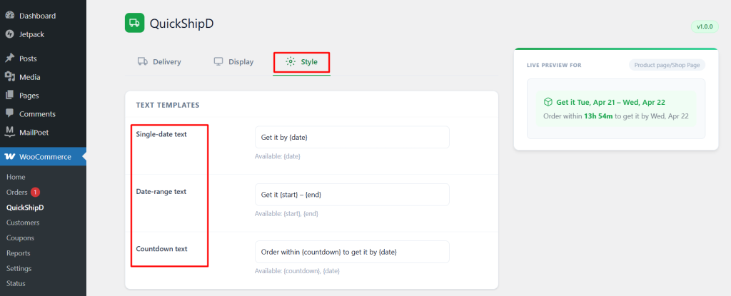
QuickShipD’s Style tab lets you edit these templates directly, and the date format setting also affects mobile readability — a shorter format like “May 14” often fits better on small screens than a fully spelled-out “Thursday, May 14th.”
| 💡 PRO TIP After editing your text template, actually open your product page on your own phone and check it. The live preview in settings is useful, but nothing replaces seeing it on the actual device your customers are using. |
Checking Placement on Mobile, Not Just Desktop
Whatever positions you’ve enabled in the Display tab — product page, cart, checkout — verify each one specifically on a mobile browser. A layout that looks perfect on desktop can occasionally push an element to an unexpected spot once your theme’s mobile styles take over.
Design for the Screen Most Customers Actually Use
A delivery estimate only does its job if customers actually read it, and on mobile that means shorter text and a genuine check of how it renders on a real device. A few minutes adjusting your templates can be the difference between an estimate that gets noticed and one that gets skimmed past.
QuickShipD’s Style tab gives you full control over that wording, with a live preview to check as you go.