
Two stores can show the exact same delivery window — “Get it by Thursday” — and one reads as confident and trustworthy while the other looks like an afterthought squeezed in below the price. The words are identical. The difference is almost always color and contrast.
Here’s how color choices affect whether your delivery estimate actually gets read, and how to pick colors that build trust rather than get ignored.
Why Color Affects Whether Text Gets Read at All
Low-contrast text — light gray on white, for instance — is easy for the eye to skip over entirely, even when it’s positioned exactly where it should be. A delivery estimate that’s technically present but visually faint might as well not exist for a shopper skimming the page.
On the other end, a delivery estimate in a jarring or unrelated color can look like an error message or a warning rather than a helpful piece of information, simply because the color doesn’t match the tone of a confident statement.
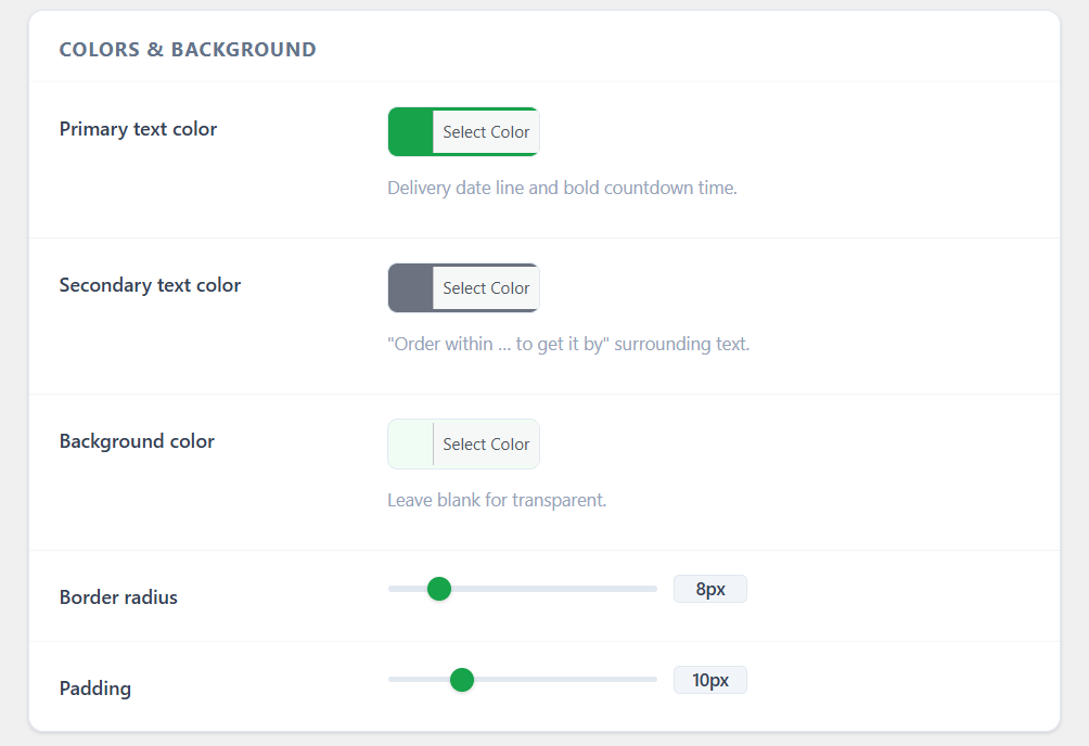
| 🎯 NOTE There’s no single “correct” color for a delivery estimate — what matters is contrast against your background and consistency with the rest of your product page’s visual hierarchy. |
Matching Your Theme Without Disappearing Into It
The goal isn’t to make the delivery estimate blend in so much that it becomes invisible — it’s to make it feel native to your design while still being noticeable. Using your theme’s existing accent color for the primary text (often the same color as your “In Stock” label or a link) is a reliable middle ground.
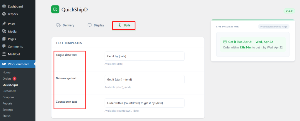
QuickShipD’s Style tab separates primary and secondary text color, which is useful for date-range or countdown displays — use your stronger accent color for the main date, and a lighter secondary shade for supporting text like the countdown line, so the hierarchy between them is visually clear.
| 💡 PRO TIP Green is commonly associated with confirmation and availability across eCommerce (think “In Stock” labels), which is part of why it’s a common choice for delivery estimates too. It’s a reasonable default, but it should still match your specific brand palette rather than being adopted purely because it’s common. |
Checking Contrast, Not Just Color
Whatever color you choose, check it against your actual background color, not just how it looks in isolation. A color that looks fine on a white settings preview can still fail to stand out against a textured or off-white product page background.
Make It Noticeable, Not Just Present
A delivery estimate only helps if shoppers actually see it, and color is one of the simplest levers for making sure that happens. A few minutes matching your theme’s accent color and checking real contrast is a small effort with a real payoff.
QuickShipD’s Style tab gives you direct control over both primary and secondary colors, with a live preview to check as you adjust.
Related Reading
- Should You Show a Delivery Estimate for Digital + Physical Bundles?
- How to Audit Your Delivery Estimate Accuracy Every Quarter
- Do Delivery Estimates Affect Your Google Shopping Ads?
- How to Explain Delivery Estimate Value to Clients (For Agencies and Freelancers)
- How Peak-Season Shipping Delays Affect Customer Trust